Your logo is the cornerstone of your brand’s visual identity. It’s what people see first when they visit your website, find you on Google, or share your links on social media. Because it appears in so many different places, a single logo file simply won't cut it.
Are you a Cohesive Digital Website Builder or Website Design client? You can share this exact guide with your graphic designer to ensure they provide you with the comprehensive "Logo Toolkit" you need to make your new website look flawless.
Here is everything your designer needs to know to get your brand website-ready.
Consistency, Adaptability, and Quality
When outfitting your new website, your logo needs to check three boxes:
- Consistency: Using the correct, standardized files ensures your brand looks professional and polished across every device and platform.
- Adaptability:
Your primary website logo needs to be a different size and shape than your social media share image or your browser tab icon.
- Quality: Make sure your logo is high-resolution and vector-based where possible. This ensures it looks sharp on everything from a mobile phone to a 4K desktop monitor.
Pro Tips for a Flexible Logo
Before we get into specific pixel sizes, it’s crucial to understand how logos are used in modern web design. A truly flexible brand identity requires variations in both color and shape.
1. Color Variations (Light, Dark, and Brand Colors)
Your website will likely utilize multiple background colors across different sections. A logo that looks amazing on a clean, white header might completely disappear when placed over a dark footer or a vibrant photograph.
To ensure maximum flexibility, ask your designer to export transparent versions of your logo in the following colors:
- Brand Color(s): Your standard, full-color logo.
- All-Black: For use on very light or busy backgrounds.
- All-White (Reversed): For use on dark backgrounds or solid brand-color blocks.
Having all three of these options with transparent backgrounds guarantees your logo will look great no matter where we place it on your site.
2. Aspect Ratios (Landscape Primary Logo vs. Square Icon)
A common mistake businesses make is using the exact same logo file for a wide website header and a tiny square browser tab.
When a detailed, wide logo is scaled down to fit inside a small square box, it becomes microscopic and impossible to read. To solve this, your brand needs two distinct layouts:
- The Landscape Primary Logo: This is your full logo, typically wider than it is tall, used for your main website header.
- The Square Icon (or Brand Mark): This is a highly simplified, perfectly square version of your logo used for avatars, mobile apps, and favicons. It needs to be simple enough that it remains recognizable even when scaled down to the size of a fingernail.
The Google Example:
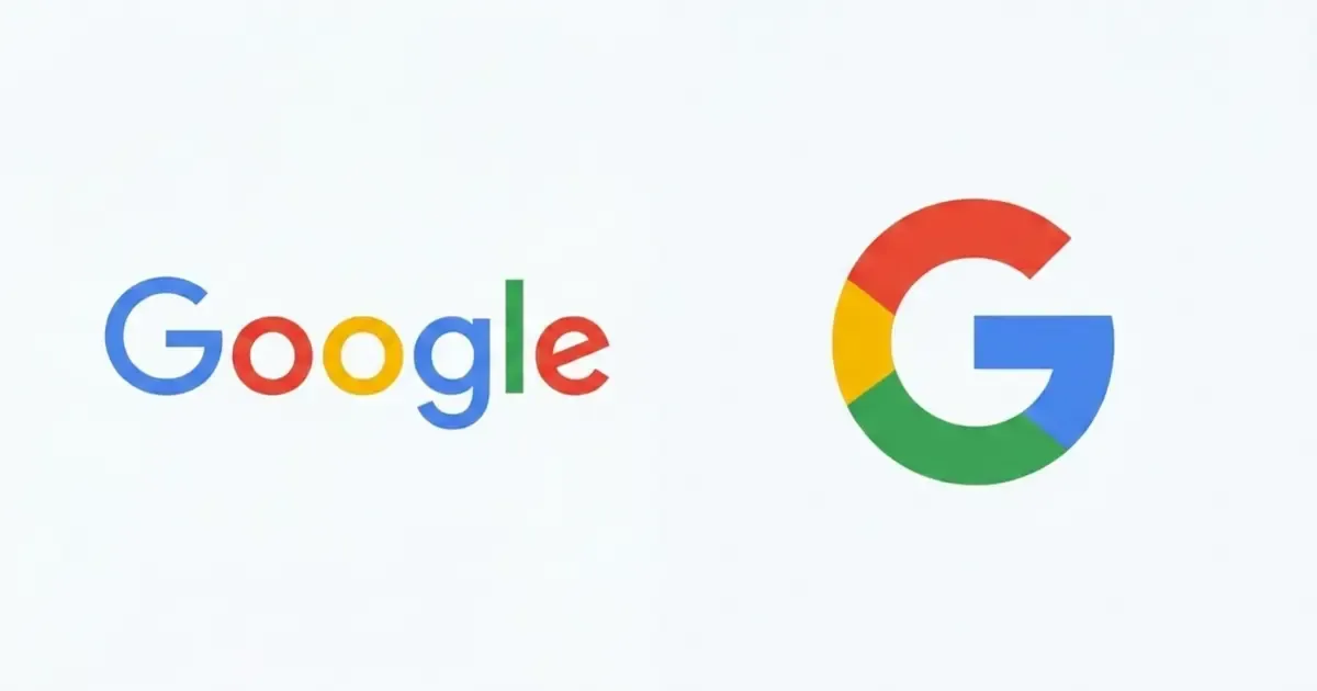
Think of Google. Their Landscape Primary Logo is the full word "Google" spelled out in their signature colors. However, for their browser tab favicon and mobile apps, they don't try to shrink the whole word into a tiny box. Instead, they use their Square Icon, the single, multicolored "G".
The Essential "Logo Toolkit" for Your Cohesive Digital Website
To ensure your website is fully optimized, here are the exact use cases and specifications your designer needs to provide in those different color and layout variations:
1. Primary Website Logo (Header & Footer)
This is the Landscape Primary Logo that will likely appear at the top of your website and in your footer.
- File Format: SVG (Highly Recommended) or high-resolution PNG.
- Design Note: As mentioned above, it is absolutely essential that this logo has a transparent background.
2. Favicon
Your favicon is the small icon that appears next to the page title in your browser tab and on Google's mobile search results. It allows users to identify and navigate to your site easily. This should utilize your simplified Square Icon.
- Resolution: Typically 48 x 48 pixels
- File Format: .ico (Highly Recommended) or .png
3. Social Networks Image (Open Graph)
This is the image designated to display on Facebook, X (formerly Twitter), LinkedIn, and other social networks when people share your site on those platforms.
- Resolution: 1200 x 630 pixels
- File Format: .png or .jpg
4. Home Screen Icon (Mobile & Tablet)
Home screen icons are a mobile phone version of bookmarks and appear on iPhone and iPad devices when your site is bookmarked on the home screen. Users are able to save a home screen icon on their phone's home screen as if the site were an app. Clicking this icon on mobile devices brings users to your site. This should utilize your simplified Square Icon.
- Resolution: This image should be a perfect square and at least 57 x 57 pixels in size.
- File Format: .png
File Formats Explained (For the Non-Designers)
If you are requesting these files from a designer or trying to export them yourself, here is a quick cheat sheet on what these file formats actually mean:
- SVG (.svg): The gold standard for web logos. SVG is a vector format, meaning it can be scaled up to the size of a billboard or down to the size of a postage stamp without losing an ounce of quality.
- PNG (.png): Best for graphics and logos when SVG isn't an option. PNG features lossless compression (no quality loss) and supports transparency, which is crucial for modern web design.
- JPG (.jpg or .jpeg): Best for standard photos or complex images where transparency isn't needed. Keep in mind that JPGs use "lossy" compression, meaning they can lose some crispness when saved.
- WebP (.webp): A modern image format that provides superior compression for images on the web. It keeps file sizes incredibly small (improving your website's load speed and SEO) while still supporting transparency.
- ICO (.ico): A format specifically designed for favicons.
Final Thoughts
By coming prepared with this logo toolkit, your website build will go much smoother, and you'll guarantee a great first impression for your potential customers. Just hand this checklist to your designer and you’re ready to go!
Ready to build a beautiful brand presence online?
Whether you want to do it yourself with our intuitive Website Builder or you want us to handle it for you through our custom Website Design services, Cohesive Digital has the tools you need to succeed online. Contact us today to get started!